

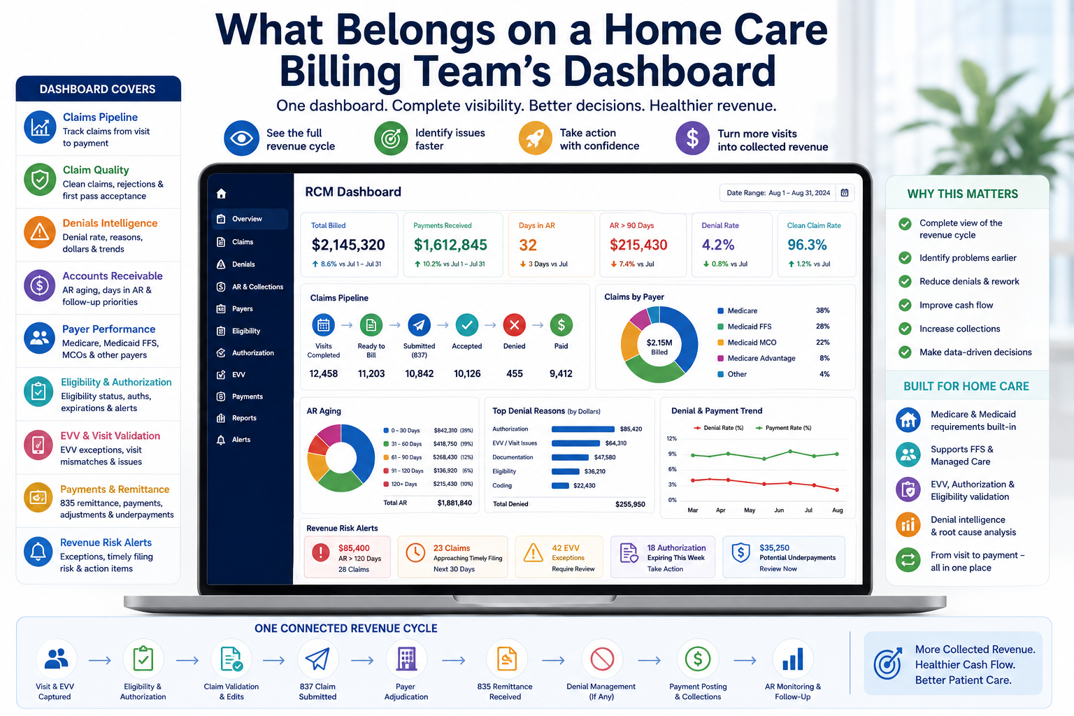
A practical guide to the KPIs, payer insights, denial signals, and revenue-cycle data that Medicare and Medicaid home care billing teams should monitor every day.
For a home care billing team, a dashboard should do much more than display how many claims were submitted.
A useful dashboard should answer a more important question:
Where is our revenue right now, and what is preventing it from becoming cash?
This matters particularly for agencies billing Medicare, Medicaid, and Medicaid managed-care plans, where eligibility, authorization, documentation, EVV, coding, payer-specific rules, claim submission, denials, and remittance processing can all affect reimbursement.
Healthcare revenue-cycle organizations increasingly use standardized KPIs across areas such as pre-billing, claims, account resolution, and financial management. HFMA’s MAP Keys, for example, include metrics such as clean claim rate, aged A/R, remittance denial rate, denial write-offs, and net Days in A/R.
But a home care agency should not simply copy a hospital dashboard.
The best dashboard is built around the actual revenue cycle of home-based care.
Why a Billing Dashboard Matters
Without a centralized dashboard, billing teams often work from multiple reports:
- One report for claims
- One for denials
- One for payments
- One for AR
- Another for payer responses
The result is a fragmented view of revenue.
A claim might be sitting in a denial queue while another report shows it as unpaid AR. A Medicaid claim might be waiting because of an EVV mismatch, but the billing manager may not see the connection between the visit problem and the aging balance.
A good dashboard brings these signals together.
Instead of asking:
How many claims are unpaid?
the team can ask:
Why are these claims unpaid, which payer is responsible, how old are they, and what action is required?
That is the difference between a reporting dashboard and a revenue-cycle management dashboard.
What Should Be on the Dashboard?
A strong home care billing dashboard should generally be organized into seven areas:
- Claims Pipeline
- Clean Claim & Rejection Performance
- Denials
- Accounts Receivable
- Payer Performance
- Cash & Revenue Recovery
Let’s look at each one.
1. Claims Pipeline: How Much Revenue Is Moving?
The first section should show the current status of claims moving through the revenue cycle.
At minimum, monitor:
- Visits/services completed
- Billable visits
- Claims ready to bill
- Claims generated
- Claims submitted
- Claims accepted
- Claims rejected
- Claims denied
- Claims pending
- Claims paid
This creates a simple visual pipeline:
Service Delivered
↓
Billing Ready
↓
Claim Created
↓
Claim Validated
↓
837 Submitted
↓
Accepted
↓
Adjudicated
↓
835 Received
↓
Paid / Denied
The purpose is to identify where claims are getting stuck.
For example, if 10,000 visits were completed but only 9,300 claims were generated, the problem is not necessarily the payer.
The problem may be inside the agency’s pre-billing process.
HFMA similarly separates pre-billing measures from claims and account-resolution measures, recognizing that problems can occur before a claim even reaches the payer.
2. Clean Claim Rate: Are We Sending Claims Correctly?
One of the most important dashboard KPIs should be the Clean Claim Rate.
A clean claim is essentially a claim that can move through the billing process without requiring manual correction.
HFMA’s MAP Key CL-1 measures clean claim rate based on claims that pass required edits without manual intervention.
A dashboard should display:
Clean Claim Rate = Clean Claims ÷ Claims Entering the Claims Process × 100
For example:
- Claims processed: 10,000
- Clean claims: 9,600
- Clean claim rate: 96%
But don’t stop at the percentage.
Also display:
Top claim-edit reasons
- Eligibility
- Authorization
- Missing information
- Invalid member ID
- Coding
- Units
- Provider information
- EVV mismatch
- Payer-specific requirements
This tells the billing manager what needs to be fixed.
3. Rejections: Don’t Mix Them With Denials
This distinction is important.
A rejection generally means the claim failed before or during the payer’s initial processing and needs correction before it can move forward.
A denial occurs after adjudication, when the payer determines that the claim or service will not be paid as submitted.
Your dashboard should therefore have separate KPIs:
Rejection Rate
and
Denial Rate
If these are combined into one number, management can lose visibility into where the problem actually occurred.
For example:
High rejection rate → pre-submission/data-quality problem
High denial rate → payer/adjudication/claim-compliance problem
Different problems require different solutions.
4. Denial Dashboard: What Is Stopping Payment?
Denials deserve their own dashboard section.
At minimum, show:
- Initial denial rate
- Denied claims
- Denied dollars
- Top denial reasons
- Denials by payer
- Denials by service
- Denials by state
- Denials by location
- Denials by month
- Denials resolved
- Denials pending
- Denial write-offs
HFMA recommends looking beyond a simple denial percentage and tracking metrics such as initial denial rate by volume and dollars, denial write-offs, time from denial to appeal, time from denial to resolution, and the percentage of initial denials overturned.
This is particularly useful for home care.
Imagine the dashboard shows:
| Denial Reason | Claims | Denied Dollars |
| Authorization | 240 | $42,000 |
| Eligibility | 150 | $19,000 |
| EVV | 130 | $24,000 |
| Documentation | 90 | $21,000 |
| Coding | 60 | $9,000 |
The billing team immediately knows where to focus.
5. Denial Rate Alone Is Not Enough
A billing manager should never look only at:
“Our denial rate is 5%.”
The next questions should be:
- How many dollars were denied?
- Which payer caused most of the denials?
- How old are those claims?
- How much has been recovered?
- How much has been written off?
- How many are repeat denials?
- What caused them?
For example:
5% denial rate
could mean:
$25,000 denied
or
$500,000 denied.
The percentage is identical.
The financial impact is completely different.
6. Accounts Receivable: Where Is the Money Stuck?
The dashboard should make AR impossible to ignore.
Track:
Total AR
Total outstanding receivables.
Days in AR
A high-level indicator of how much revenue is tied up in outstanding receivables.
AR Aging
At minimum:
- 0–30 days
- 31–60 days
- 61–90 days
- 91–120 days
- 120+ days
HFMA uses these aging categories in its standardized AR metrics and also recommends analyzing aged AR by payer group.
7. AR by Payer
This is especially important for Medicare and Medicaid.
Instead of showing:
Total AR: $1.5M
show:
| Payer | AR | >90 Days |
| Medicare | $420K | $32K |
| Medicaid FFS | $360K | $58K |
| Medicaid MCO A | $310K | $92K |
| Medicaid MCO B | $250K | $75K |
| Other | $160K | $28K |
Now management can see where the problem actually is.
If one Medicaid managed-care payer has disproportionately high AR over 90 days, that deserves immediate investigation.
The overall AR number alone would hide this.
8. Eligibility: Check Before Billing
Eligibility problems can create preventable billing issues.
A dashboard should show:
- Eligibility verified
- Eligibility pending
- Inactive coverage
- Coverage termination
- Member ID mismatch
- Payer mismatch
- Coordination-of-benefits issues
The goal is not merely to report failed eligibility checks.
The dashboard should show:
How many upcoming services have unresolved eligibility issues?
That changes the metric from historical reporting to proactive prevention.
9. Payment & Remittance Dashboard
The billing team’s job doesn’t end when a claim is submitted.
The next question is:
What did the payer actually do with the claim?
Track:
- Payments received
- Claims paid
- Partial payments
- Zero-payment claims
- Adjustments
- Denials
- Underpayments
- Unapplied cash
- Missing remittances
For electronic workflows, this includes monitoring 835 remittance information.
HFMA’s remittance denial metric uses 835 files or paper remittances to identify actionable denied claims.
This gives the billing team a complete loop:
837 Claim → Payer Adjudication → 835 Remittance → Payment/Denial → AR
10. Days to Bill
One of the most overlooked dashboard metrics is:
How quickly do we bill after the service is delivered?
Consider:
Service completed Monday
↓
Claim generated Thursday
↓
Claim submitted Friday
The payer’s payment cycle didn’t really begin when the service occurred.
It began when the claim was successfully submitted.
Therefore, monitor:
Date of Service → Claim Creation
and
Claim Creation → Claim Submission
HFMA’s MAP Keys include pre-billing measures such as total charge lag days and days in claims that have been finalized but not submitted.
For a home care agency, this can identify internal billing delays before blaming the payer.
11. Timely Filing Risk
A good dashboard should also identify claims approaching payer filing deadlines.
Display:
- Claims approaching timely filing
- Claims at risk
- Claims past filing deadline
- Timely filing denials
- Days remaining to submit
This is particularly useful because a claim can be perfectly valid but still become uncollectible if it misses the applicable filing deadline.
The exact deadline depends on the payer and applicable rules, so the dashboard should use payer-specific configuration, not one universal deadline.
12. Underpayments
Denials get a lot of attention.
Underpayments often don’t.
A claim can be marked:
Paid
while the payment is still incorrect.
The dashboard should therefore identify:
- Expected reimbursement
- Actual reimbursement
- Payment variance
- Underpaid claims
- Underpayment dollars
- Underpayment by payer
This is particularly important when agencies work with multiple Medicaid programs and managed-care organizations with different reimbursement arrangements.
13. Cash Collection
At the executive level, the dashboard should answer:
How much cash did we actually collect?
Track:
- Daily collections
- Weekly collections
- Monthly collections
- Collections by payer
- Expected collections
- Actual collections
- Collection variance
This connects the billing team’s activity to the organization’s financial performance.
HFMA’s MAP Keys include cash collection as a percentage of net patient revenue as a financial-management KPI.
14. The Dashboard Should Show Trends, Not Just Today’s Number
A single number has limited value.
For example:
Denial Rate: 6.2%
What does that mean?
You need the trend.
Last 6 months:
| Month | Denial Rate |
| March | 8.4% |
| April | 7.9% |
| May | 7.2% |
| June | 6.8% |
| July | 6.5% |
| August | 6.2% |
Now management can see that performance is improving.
The same should be done for:
- Days in AR
- Clean claim rate
- AR >90 days
- Denied dollars
- Collection rate
- Rejection rate
- Payment turnaround
Trend > snapshot.
15. The Dashboard Should Show Exceptions
A common mistake is trying to put every available metric on one screen.
That creates a dashboard full of numbers but low in actionable information.
Instead, highlight exceptions.
For example:
🔴 Immediate Action
- $85K AR >120 days
- 14 claims approaching timely filing
- 32 authorization expirations this week
- 47 Medicaid EVV exceptions
- 18 high-value denied claims
🟡 Monitor
- Medicaid MCO denial rate increased 2.1%
- Clean claim rate dropped 1.5%
- Medicare AR increased 4%
🟢 Healthy
- 97% clean claim rate
- 2.8% initial denial rate
- 94% EVV validation rate
This lets the billing manager focus on what needs attention now.
19. Recommended Home Care Billing Dashboard Layout
A practical dashboard could be organized like this:
Top Row — Executive KPIs
Claims Submitted | Clean Claim Rate | Denial Rate | Days in AR | AR >90 Days | Collections
↓
Second Row — Claims Pipeline
Ready to Bill → Submitted → Accepted → Rejected → Denied → Paid
↓
Third Row — Revenue Risk
Denied Dollars | Underpayments | AR >90 | AR >120 | Timely Filing Risk
↓
Fourth Row — Operational Exceptions
EVV Exceptions | Authorization Expirations | Eligibility Failures | Documentation Issues
↓
Bottom — Trends
30/60/90-Day Performance
This provides both the big picture and the actionable details.
Revenue Catalyst AI: One Dashboard for the Complete Revenue Cycle
For a home care billing team, the biggest challenge is often not a lack of data—it is having too much data spread across different screens, systems, reports, and workflows.
Revenue Catalyst AI brings the critical revenue-cycle information together in one centralized dashboard, giving billing managers a complete view of their Medicare and Medicaid revenue cycle without having to switch between multiple reports.
Instead of looking at claims, denials, AR, payments, eligibility, authorization, and EVV separately, the dashboard connects these areas so the team can quickly understand:
What has been billed, what has been paid, what is at risk, what is delayed, why it is delayed, and what needs attention now.
What the Revenue Catalyst AI Dashboard Covers
1. Revenue & Financial Overview
A high-level view of the agency’s financial performance:
- Total billed amount
- Total payments received
- Outstanding AR
- Days in AR
- AR >60 / >90 / >120 days
- Denied dollars
- Underpayments
- Write-offs
- Collection performance
2. Claims Pipeline
Track the complete claim journey from service to payment:
Visit Completed → Claim Ready → Validated → 837 Submitted → Accepted → Paid / Denied
The dashboard can show:
- Claims ready for billing
- Claims submitted
- Accepted claims
- Rejected claims
- Denied claims
- Pending claims
- Paid claims
- Claims requiring action
This immediately shows where claims are getting stuck.
3. Claim Quality & Denial Intelligence
The dashboard should not simply show:
“120 claims denied.”
It should help answer:
- Why were they denied?
- Which payer caused them?
- Which service was involved?
- How much revenue is affected?
- Is the denial recurring?
- Can the issue be prevented on future claims?
Key metrics include:
- Clean claim rate
- Rejection rate
- Initial denial rate
- Denial dollars
- Top denial reasons
- Denials by payer
- Denials by service
- Denials by state
- Repeat denial patterns
This turns denial data into actionable revenue intelligence.
4. 837 Claim & 835 Remittance Visibility
Revenue Catalyst AI connects the electronic claim and remittance lifecycle:
837 → Payer Adjudication → 835 → Payment / Adjustment / Denial → AR
The dashboard can help billing teams understand:
- What was submitted
- What was accepted
- What was paid
- What was adjusted
- What was denied
- What remains outstanding
This creates a clearer connection between claims and cash.
5. AR & Follow-Up Workbench
The dashboard should make aging AR actionable rather than simply displaying a balance.
Teams can identify:
- Highest-value outstanding claims
- AR >90 days
- AR >120 days
- Denied AR
- Claims requiring follow-up
- Claims approaching filing deadlines
- Payer-specific aging
- Unresolved balances
This allows billing teams to prioritize the revenue that needs attention most urgently.
