

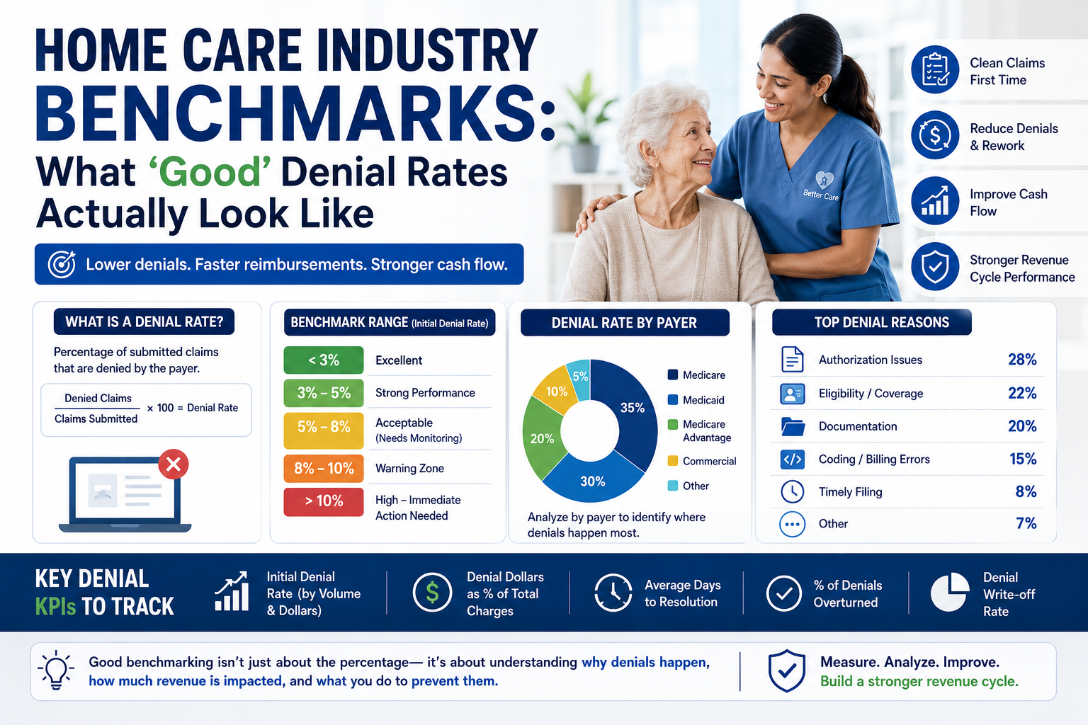
A practical guide to measuring claim denials, understanding what the numbers really mean, and setting realistic revenue-cycle targets for home care agencies.
For a home care agency, the question sounds simple:
What should our claim denial rate be?
The answer is more complicated than simply choosing a percentage.
A 2% denial rate may look excellent for one agency and completely different for another. Payer mix, Medicaid program requirements, service types, authorization processes, EVV requirements, documentation practices, claim volume, and billing technology can all affect denial performance.
There is also an important industry-data limitation: there is no single authoritative national benchmark that defines a “good” denial rate specifically for home care agencies.
That does not mean agencies cannot benchmark themselves.
It means they need to measure the right metric, compare it with relevant healthcare data, understand the causes behind the number, and establish internal performance targets based on their payer mix and operating model.
For context, HFMA recommends standardizing denial measurement using metrics such as initial denial rate by claim volume and dollars, denial write-offs, time from denial to appeal, time from denial to resolution, and the percentage of initial denials overturned. (HFMA)
So the real question is not simply:
Is our denial rate 5% or 10%?
It is:
How much revenue are we losing, why are claims being denied, how quickly are we resolving them, and are we preventing the same denials from happening again?
What Is a Claim Denial Rate?
A claim denial rate measures the percentage of submitted claims that are denied by a payer.
A simple claim-volume formula is:
Denial Rate = Denied Claims ÷ Claims Submitted × 100
For example, if an agency submits 10,000 claims during a month and 500 are initially denied:
500 ÷ 10,000 × 100 = 5%
The agency’s initial denial rate would be 5%.
However, this number alone does not tell the complete story.
Consider two agencies:
Agency A
- 10,000 claims submitted
- 500 denied
- Denial rate: 5%
- Most denials are quickly corrected and paid
Agency B
- 10,000 claims submitted
- 300 denied
- Denial rate: 3%
- A large percentage become aged AR or write-offs
Agency B has the lower denial rate, but it may have the more serious revenue problem.
This is why experienced revenue-cycle teams measure denial volume, denial dollars, root cause, recovery, and resolution time together.
First: Don’t Confuse Denial Rate With Improper Payment Rate
This is one of the most important distinctions when discussing healthcare benchmarks.
CMS reported a 6.7% improper payment rate for Medicare home health services for the 2024 reporting period, representing a projected $1.1 billion in improper payments. CMS reported that insufficient documentation accounted for 51.4% of those improper payments, followed by medical necessity at 33.7%, incorrect coding at 3.4%, and no documentation at 2.3%. (CMS)
That 6.7% is not a home health claim denial rate.
It is an improper payment rate measured through CMS’s Comprehensive Error Rate Testing methodology.
CMS explains that CERT reviews a statistically valid sample of Medicare Fee-for-Service claims to determine whether claims were paid properly under Medicare coverage, coding, and payment rules. (CMS)
This distinction matters.
An agency should not publish a statement such as:
“The national home health denial rate is 6.7%.”
That would be misleading.
A more accurate statement is:
“CMS reported a 6.7% improper payment rate for Medicare home health services for the 2024 reporting period.”
Different metrics answer different questions.
So What Does “Good” Actually Look Like?
There is no universal home care denial-rate standard.
However, broader healthcare data gives agencies useful context.
A 2025 HFMA educational presentation citing Kodiak Solutions reported that the initial denial rate across hospitals and medical practices increased to 11.81% in 2024, up 2.4% from the prior year. (HFMA)
That figure should not be interpreted as a home care benchmark. Home care has a different claim structure, payer mix, service model, and operational environment.
But it provides an important industry reference point:
A double-digit initial denial rate is not an achievement simply because it is common across the broader healthcare market.
For a home care agency, the better approach is to establish an internal target and continuously improve it.
A practical management framework could look like this:
| Initial Denial Rate | Practical Interpretation |
| Below 3% | Excellent control |
| 3%–5% | Strong performance |
| 5%–8% | Acceptable but needs monitoring |
| 8%–10% | Warning zone |
| Above 10% | Significant denial-management opportunity |
| Above 15% | Immediate root-cause investigation recommended |
Important: These ranges should be treated as practical operating targets, not official national home care benchmarks.
An agency with a complex Medicaid payer mix may reasonably experience a different baseline than an agency with predominantly traditional Medicare or a highly standardized commercial payer mix.
The goal should be to establish a defensible baseline and improve it over time.
Why a Single Denial Number Can Be Misleading
Suppose an agency says:
Our denial rate is only 4%.
That sounds good.
But management should immediately ask:
- Is that 4% based on claims or claim lines?
- Is it first-pass denial rate?
- Does it include corrected claims?
- Are payer rejections included?
- Are duplicate denials counted?
- Is the measurement based on claim volume or dollars?
- Are Medicare, Medicaid, and commercial payers combined?
- How much of the denied amount was recovered?
- How long did recovery take?
- How much was written off?
Without these definitions, two agencies can report “4% denial rates” while measuring completely different things.
That is why measurement methodology matters as much as the percentage itself.
The Most Important Benchmark: Initial Denial Rate
For operational improvement, initial denial rate is one of the most useful metrics.
HFMA defines an initial denial-rate methodology around the first denial for a claim and recommends measuring it both by claim volume and claim dollars. (HFMA)
Why is the first denial important?
Because repeated denials can distort the picture.
Imagine one claim is denied three times during the correction and resubmission process.
If an agency counts all three events, it may make its denial problem appear larger than it actually is.
A cleaner approach is to identify the first denial event and then track what happened afterward.
This allows management to ask:
How often are we getting the claim wrong the first time?
That is much more actionable.
Denial Rate by Volume vs. Denial Rate by Dollars
A sophisticated RCM operation should measure both.
Denial Rate by Volume
This tells you how frequently claims are being denied.
For example:
- 10,000 claims submitted
- 500 initially denied
- 5% denial rate
This is useful for measuring operational workload.
Denial Rate by Dollars
Now imagine those 500 denied claims represent $750,000 in billed charges.
The volume rate may be only 5%, but the financial exposure could be significant.
Conversely, an agency could have a 7% denial rate by claim count while most denied claims are low-dollar claims.
This is why a professional dashboard should show:
Denial Rate by Volume
and
Denial Rate by Dollars
HFMA specifically recommends tracking initial denials using both measures. (HFMA)
Example: Why Dollars Matter
Consider two agencies.
Agency A
- 5% claims denied
- Average denied claim: $100
- Financial impact: relatively limited
Agency B
- 3% claims denied
- Average denied claim: $1,200
- Financial exposure: potentially much larger
If management only looks at claim counts, Agency B appears healthier.
If management looks at denied dollars, the picture changes.
This is why denial rate should never be the only revenue-cycle KPI.
Benchmark #2: Denial Write-Off Rate
Some denied claims are eventually recovered.
Others are not.
If an agency has a 5% denial rate but successfully recovers almost every denied dollar, the operational impact is very different from an agency with the same denial rate but substantial write-offs.
A useful question is:
How much denied revenue ultimately becomes unrecoverable?
Track:
Denial Write-Offs ÷ Net Patient Service Revenue
HFMA includes denial write-offs as a formal revenue-cycle metric. (HFMA)
This is particularly important for executives because it translates billing problems into financial impact.
Benchmark #3: Denial Resolution Time
A denial sitting unresolved for 5 days is very different from one sitting unresolved for 90 days.
Track the time from:
Initial Denial → Final Resolution
HFMA identifies time from initial denial to claim resolution as a key claim-integrity metric. (HFMA)
A practical internal target is to continuously reduce the age of unresolved denials.
For example:
| Metric | Month 1 | Month 2 | Month 3 |
| Initial denial rate | 7.2% | 6.1% | 5.4% |
| Denied dollars | $85K | $71K | $59K |
| Average resolution time | 24 days | 19 days | 15 days |
| Write-offs | $12K | $9K | $6K |
The agency is improving even before it reaches an extremely low denial rate.
That is what good benchmarking should show.
Benchmark #4: Denial Recovery Rate
Not every denial is final.
Some are recoverable through correction, resubmission, or appeal.
Track:
Recovered Denied Dollars ÷ Total Denied Dollars
Also track the percentage of initial denials overturned.
HFMA includes the percentage of initial denials overturned as a key claim-integrity metric. (HFMA)
This helps answer:
“Are we good at recovering the revenue we initially lost?”
But there is an even more important question:
“Why are we creating those denials in the first place?”
Recovery is valuable.
Prevention is better.
Benchmark #5: First-Pass Acceptance
Denial rate and first-pass acceptance are closely related but should not be treated as identical metrics.
If more claims are accepted correctly the first time, the agency generally creates less rework.
For example:
100,000 claims submitted
- 95,000 accepted without denial
- 5,000 initially denied
First-pass performance is significantly better than an operation where 90,000 are accepted and 10,000 require intervention.
The objective should therefore be:
More clean claims entering the payer’s workflow the first time.
What Denial Rate Is Healthy for a Home Care Agency?
Instead of asking for one universal number, think in terms of performance bands.
Below 3% — Excellent
An agency operating below 3% initial denials may have strong controls around:
- Eligibility
- Authorization
- EVV
- Documentation
- Coding
- Claim validation
- Payer-specific rules
However, management should still verify that the low number is not caused by incomplete reporting.
A surprisingly low denial rate can sometimes indicate a measurement problem.
3%–5% — Strong
This is a reasonable operational target for many well-controlled billing environments.
The focus should shift from simply reducing the percentage to understanding the remaining denial categories.
For example:
- Are most denials payer-specific?
- Are they concentrated in one state?
- Are they caused by authorization?
- Are they documentation-related?
- Are they concentrated among a small number of caregivers or locations?
At this level, root-cause analysis becomes more important than simply chasing another percentage point.
5%–8% — Watch Carefully
This range does not automatically mean the billing operation is failing.
But it should trigger investigation.
Management should identify:
- Top denial reasons
- Top payers
- Highest-denial service codes
- Denial dollars
- Aging
- Recovery rates
If the rate is consistently moving downward, the operation may be improving.
If it is increasing month after month, something in the revenue cycle may be changing.
8%–10% — Warning Zone
At this level, denials can become a significant operational burden.
Billing teams may spend substantial time on:
- Rework
- Resubmission
- Payer calls
- Documentation requests
- Appeals
- AR follow-up
The agency should identify whether the problem originates upstream.
For example:
Authorization → Visit → EVV → Documentation → Claim → Payer
The denial may appear in billing, but the root cause may have occurred much earlier.
Above 10% — Significant Opportunity
A double-digit initial denial rate deserves management attention.
Broader healthcare data reported by HFMA in 2025 showed an 11.81% initial denial rate for hospitals and medical practices in 2024. Again, this is not a home care benchmark, but it illustrates how costly denial friction has become across healthcare. (HFMA)
For a home care agency consistently above 10%, leadership should consider a structured denial-reduction program rather than treating denials as normal billing workload.
The Five Denial Categories Home Care Agencies Should Watch
1. Eligibility and Coverage
Examples:
- Inactive coverage
- Incorrect member ID
- Wrong payer
- Coverage terminated
- Coordination-of-benefits issues
These are often preventable through better eligibility verification.
2. Authorization
Authorization-related problems can include:
- Missing authorization
- Expired authorization
- Incorrect authorization number
- Exceeded units
- Service outside authorized dates
For home care agencies, authorization management should be connected to scheduling, visit data, and billing whenever possible.
3. Documentation
Documentation remains a major risk area.
CMS’s 2024 Medicare home health data found insufficient documentation responsible for 51.4% of home health improper payments in its sample. (CMS)
This is not the same as saying 51.4% of claims were denied.
But it demonstrates how important documentation quality is to payment integrity.
4. Coding and Billing
Examples include:
- Incorrect procedure code
- Incorrect modifier
- Incorrect units
- Incorrect diagnosis
- Incorrect provider information
These issues are often strong candidates for automated claim validation.
5. EVV and Visit-Level Issues
For applicable Medicaid services, the relationship between the actual visit and the submitted claim can be critical.
Potential problems include:
- Missing EVV record
- Mismatched times
- Incorrect caregiver
- Incorrect service
- Duplicate visit
- Units inconsistent with visit data
The earlier these discrepancies are identified, the easier they are to resolve.
Why Payer-Level Benchmarking Is More Useful
An agency may have an overall denial rate of 5%.
That sounds reasonable.
But what if the payer breakdown looks like this?
| Payer | Claims | Initial Denial Rate |
| Medicare | 4,000 | 2.1% |
| Medicaid A | 5,000 | 3.4% |
| Medicaid B | 3,000 | 8.9% |
| Medicare Advantage | 2,000 | 10.5% |
| Commercial | 1,000 | 4.2% |
The overall number hides the real problem.
Medicare Advantage and Medicaid B deserve attention.
This is why home care agencies should benchmark by:
- Payer
- State
- Service type
- Location
- Provider
- Denial category
- Claim type
- Month
The overall denial rate is the starting point—not the final answer.
Don’t Benchmark Medicare, Medicaid, and Medicare Advantage Together
Different payer environments create different billing challenges.
Traditional Medicare
The agency may face requirements involving:
- Eligibility
- Coverage
- Documentation
- Medical necessity
- Coding
- Certification
- Plan-of-care requirements
Medicaid
Rules can vary significantly by state and program.
Agencies may encounter:
- EVV requirements
- State-specific authorization
- Managed-care rules
- Service-unit limits
- Program-specific billing requirements
Medicare Advantage
Plans can introduce payer-specific workflows and requirements that differ from traditional Medicare.
Therefore, combining all payers into a single benchmark can hide important problems.
A better dashboard might show:
Medicare Denial Rate
Medicaid Denial Rate
Medicare Advantage Denial Rate
Commercial Denial Rate
Then compare performance within each category.
What Causes a Denial Rate to Increase?
When denial rates suddenly rise, don’t immediately assume the billing team is making more mistakes.
Several things can change.
Payer policy changes
A payer may change billing requirements.
State Medicaid changes
A new Medicaid rule or managed-care requirement can affect claim processing.
Authorization changes
New authorization limits or workflows can create unexpected denials.
EVV changes
System or data synchronization problems can create claim discrepancies.
Staffing changes
New billing staff may require additional training.
System changes
A billing-system update or integration issue can introduce errors.
Payer mix changes
An agency that expands into a more complex payer environment may naturally experience a different denial profile.
This is why trend analysis is essential.
The Best Benchmark Is Your Own Trend
Suppose an agency starts with:
9.5% denial rate
Then improves:
8.1% → 6.7% → 5.4% → 4.8%
Even if another agency reports 3%, this agency is making meaningful progress.
Benchmarking should therefore have two dimensions:
External benchmark
How does our performance compare with broader healthcare data?
Internal benchmark
How is our performance changing over time?
The second is often more actionable.
A Better Home Care Denial Dashboard
A professional RCM dashboard should include more than one KPI.
At minimum, track:
Claim Performance
- Claims submitted
- Initial denial rate
- First-pass acceptance
- Rejection rate
Financial Impact
- Denied dollars
- Denial dollars as % of charges
- Write-offs
- Underpayments
Recovery
- Denied dollars recovered
- Appeal overturn rate
- Resubmission success rate
Speed
- Average days to work denial
- Average days to appeal
- Average days to resolution
Root Cause
- Eligibility
- Authorization
- Documentation
- Coding
- EVV
- Duplicate
- Timely filing
- Medical necessity
- Other payer-specific reasons
Payer Analysis
- Denial rate by payer
- Denial dollars by payer
- Top denial reason by payer
This gives leadership a much more complete picture of revenue-cycle health.
What “Good” Denial Management Looks Like
A low denial rate is good.
But a mature revenue cycle goes further.
A strong operation should be able to answer:
1. How many claims are denied?
2. How many dollars are denied?
3. Why are they denied?
4. Which payer is responsible for most of the problem?
5. How quickly are denials being worked?
6. How much revenue is recovered?
7. How much is written off?
8. Are the same denials happening repeatedly?
9. What process caused the denial?
10. What has been changed to prevent it?
That last question is particularly important.
If an agency fixes 500 claims but receives the same 500 denials next month, it has managed the symptoms—not the cause.
Prevention vs. Denial Management
There are two sides to revenue-cycle performance.
Denial Management
The claim was denied. What do we do now?
Denial Prevention
Why did this happen, and how do we stop it from happening again?
A mature organization needs both.
For example:
Denial: Units exceeded authorization.
Management response: Correct and resubmit the claim.
Prevention response: Connect authorization limits to visit and billing validation so the claim is flagged before submission.
That is the difference between reactive and proactive RCM.
Where Technology Can Improve Denial Performance
Manual review becomes difficult as claim volume increases.
A modern revenue-cycle workflow can validate claims before they are submitted.
For example:
Visit Data
↓
EVV Validation
↓
Authorization Check
↓
Payer Rule Validation
↓
Claim Creation
↓
Pre-Submission Claim Scrubbing
↓
837 Submission
↓
Payer Response
↓
835 Remittance
↓
Payment Posting
↓
Denial Detection
↓
AR Follow-Up
The goal is to move error detection as far upstream as possible.
The earlier an error is found, the less expensive it generally is to correct.
The Real Cost of a 5% Denial Rate
Let’s make the impact practical.
Suppose an agency submits:
10,000 claims per month
and has a:
5% initial denial rate
That means:
500 claims require additional attention.
If a biller spends only 15 minutes on average handling each denied claim:
500 × 15 minutes = 7,500 minutes
That equals:
125 staff hours
And that is before considering:
- Payer calls
- Documentation retrieval
- Appeals
- Resubmissions
- Follow-up
- AR aging
- Lost cash-flow opportunity
This is why even a seemingly “reasonable” denial rate can create significant operational cost.
What Good Looks Like
Ultimately, a “good” denial rate is not just a number.
It is a combination of:
Low initial denials
- Low denial dollars
- Fast resolution
- High recovery
- Low write-offs
- Declining repeat denials
- Strong first-pass acceptance
- Clear root-cause visibility
An agency with a 4% denial rate and no understanding of why claims are denied is not necessarily healthier than an agency with a 5% rate and a disciplined process that is reducing denials every month.
The strongest operation knows exactly:
what is being denied,
why it is being denied,
how much revenue is affected,
how quickly it is recovered,
and
what is being changed to prevent recurrence.
How Revenue Catalyst AI Helps Home Care Agencies Reduce Denials
Revenue Catalyst AI helps home care agencies move from reactive denial management to proactive denial prevention by validating claims before submission, checking visit and authorization data, applying payer-specific billing rules, and identifying potential errors before they become denials. The platform also connects the claims lifecycle with 837 submission, 835 remittance processing, denial reason analysis, and AR follow-up, giving billing teams visibility into not only what was denied, but why it was denied and how to prevent it from happening again. By turning recurring denial patterns into actionable insights and automated validation rules, Revenue Catalyst AI helps agencies improve first-pass claim acceptance, reduce rework, accelerate reimbursement, and protect revenue.
Conclusion
There is no single number that defines a “good” denial rate for every home care agency.
The right benchmark depends on payer mix, service model, state requirements, claim complexity, technology, and the agency’s existing revenue-cycle processes.
Broader healthcare data shows that denial pressure remains significant. HFMA’s standardized framework emphasizes measuring initial denials by both volume and dollars, along with denial write-offs, resolution time, and overturn rates. (HFMA)
CMS data also shows that payment accuracy remains a meaningful issue in home health. For the 2024 reporting period, CMS reported a 6.7% improper payment rate for Medicare home health services, with documentation and medical-necessity issues accounting for a large share of the identified improper payments. (CMS)
But the most useful benchmark for an agency is ultimately its own performance trend.
If your agency is at 10% today and moves to 7%, then 5%, then 3.5%, that is meaningful revenue-cycle improvement.
The goal is not to chase an arbitrary industry percentage.
The goal is to build a revenue cycle where:
claims are validated before submission,
denials are identified quickly,
root causes are visible,
recoverable revenue is recovered,
and
the same errors become less likely to happen again.
That is what good denial performance actually looks like.
